Let‘s get in touch – info@hotzbrandconsultants.ch
Sennweidstrasse 35
6312 Steinhausen / Zug

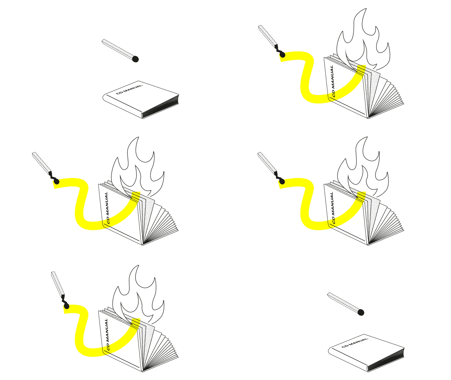
Burn Your CD Manual
For years and decades, it was the epitome of every brand design project, the pride and joy of the agency and the client: the corporate design manual. The reference work by which all those professionally involved with a company's brand should act and think. So much for the theory.Dusty, Unwieldy, and Too Thick
Practice often looks different. In many companies, the CD manual often has more the reputation, attractiveness and usefulness of a telephone directory. And just like a telephone book, many CD manuals become somewhat outdated over time. A relic from a bygone era, what was once indispensable is now obsolete in many ways. To really make an impact in the digital present, you need more of the right and less of the wrong.
In the following, I have compiled the three most serious mistakes that many CD manuals unfortunately still make today.

Mistake #1: The Content
In most CD manuals of today’s companies, the holy three kings of the old branding world are enthroned: the letterheads, the photography style, and the brochure column grid. In the past, these were often important guidelines for time-honoured print designers and photographers who used these rules to develop the defining contact points of brands.
But times have changed, and people's information consumption habits with them. Today, the importance of a beautiful letterhead for the brand experience provided to the customer is rather negligible. Brochures are almost no longer read. Imagery is often de facto unfeasible for modern companies aiming for editorial branding that requires a lot of content quickly.
On the other hand, what is completely missing in most of today's manuals are branding elements that are necessary for daily storytelling in moving images: animation behaviour, an illustration style optimised for animation, music guidelines, or an audio logo.
Mistake #2: Depth
Besides the fact that many of today's CD manuals cover the wrong topics, it is often remarkable how much detail is put into the definitions described in the various chapters. It is not uncommon to find pages of measurements of printed matter and construction drawings of logos. This was important in the past when print designers still sketched their maquettes by hand and logos were drawn for posters but is totally redundant since the invention of templates and vector-based file formats.
Moreover, in very few CD manuals is it possible for the reader to choose the level of detail in the information according to his or her needs. This means reading not infrequently more than 100 pages of rules and regulations which in turn means that the manual is a) not read at all or b) only read very superficially.
Mistake #3: The Form of Presentation
Many manuals today are presented in the form of PDF files. This is much better than a federal folder because PDFs today are capable of user interaction and media enrichment. Explanatory animations or atmospheric brand identity films could certainly be technically integrated, and important assets such as logos or downloads can easily be embedded in a PDF via a download link. Unfortunately, this is rarely done, not least because the files with embedded media can sometimes become very large.
New Approaches are Needed
It is better to set up and manage a brand management platform than a closed PDF package. Smaller updates can be made available to all users simultaneously at any time. Downloads and online generators such as Web2Print modules simplify the handling of the most important brand assets considerably. The latest generation of brand portals makes it possible to create user profiles in which users can compile their own brand construction kit and subscribe to topics that are relevant to them. This is all in line with how modern people are accustomed to handling content.
Creating Impact for the Goldfish Attention Span
You can think it's good or bad, but it's a fact: people today have no patience anymore. Researchers speak of an attention span of 8 seconds which is one second less than a goldfish. They only take in information if it a) is relevant to them right now, and b) is presented in an intuitively understandable way.
Everything else usually leads to not listening or not being understood. Those who have internalised this and realised that corporate design manuals only generate impact if they are understood by people will approach the creation of their own manuals differently in the future. Anyone who would like professional support is cordially invited to give us a call.

Written By
Patrick Ensslin
Brand Experience Director
Share Article
More Insights
Related Articles
Subscribe
LOOK AROUND
CONTACT
SOCIAL
- © 2026 Hotz Brand Consultants |All Rights Reserved
|
- Privacy Policy |
- Trust Center


